GRubbi: Swipe, Choose, Grub
GRubbi:
Swipe, Choose, Grub
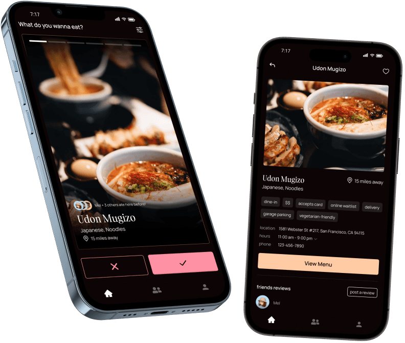
I designed a mobile app that helps you quickly choose a dining spot by swiping through restaurant options and reading fun reviews from your friends.


Problem
Context
“What do you wanna eat?” It’s the question my friends and I always ask during our hangouts, and it often leads to indecision and lengthy discussions. With so many dining options and varying preferences, deciding where to eat can become a daunting task. The process can be stressful, time-consuming, and sometimes even lead to disagreements.
Challenge
How can I design an app that simplifies dining decisions while ensuring the process remains enjoyable and engaging?
Challenge
How can I design an app that simplifies dining decisions while ensuring the process remains enjoyable and engaging?
Challenge
How can I design an app that simplifies dining decisions while ensuring the process remains enjoyable and engaging?
Solution
Plated Dish
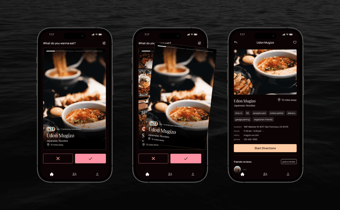
I designed Grubbi to provide a fun and efficient way to choose where to eat by combining swiping features with playful social elements.
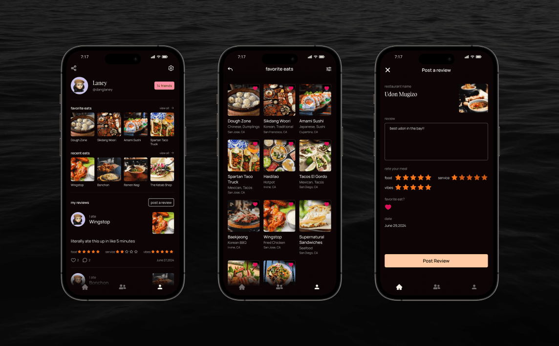
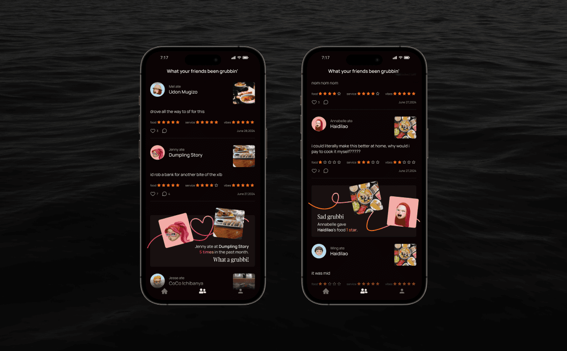
The swiping feature quickly narrows dining options, streamlining decision-making. The app shows nearby restaurants and which ones friends have visited, simplifying selection. Users can see friends' reviews, ratings, and visit frequency stats, adding a fun, social element to dining.






Research insights
Diners' Path
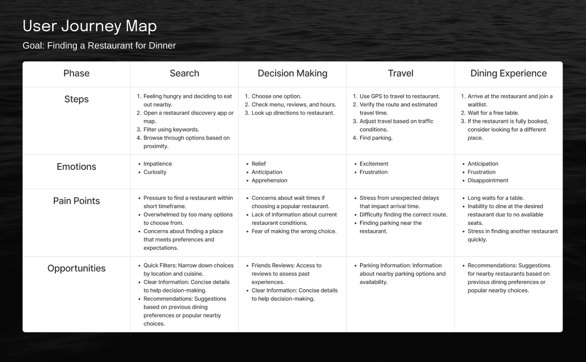
I started by conducting interviews to understand user needs and behaviors, asking about their typical restaurant selection process, current methods, and key information they look for. These insights revealed users' pain points and preferences. I then created a user journey to determine how I could enhance the dining search experience.
ideation
Cooking Instructions
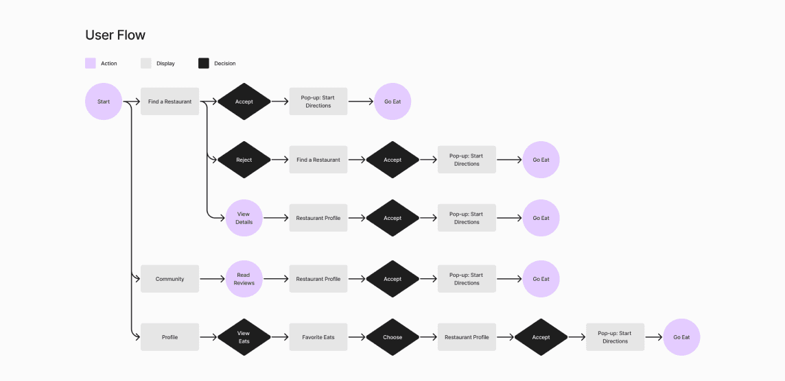
I brainstormed and sketched ideas, then developed a user flow to map out the app’s navigation. This helped visualize the app’s structure and ensure a seamless user experience.
Cooking Instructions
I brainstormed and sketched ideas, then developed a user flow to map out the app’s navigation. This helped visualize the app’s structure and ensure a seamless user experience.
Cooking Instructions
I brainstormed and sketched ideas, then developed a user flow to map out the app’s navigation. This helped visualize the app’s structure and ensure a seamless user experience.
design iteration
Recipe Development
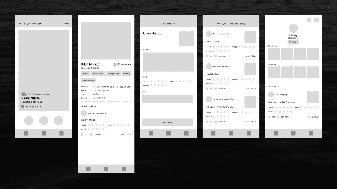
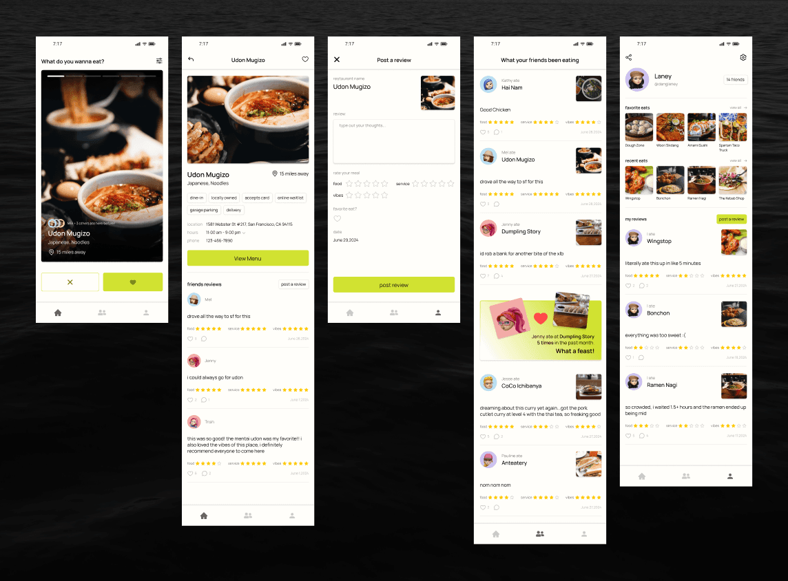
During the design process, I developed wireframes to establish layout and functionality, and then created high-fidelity mockups to refine visual details and the user interface.
Recipe Development
During the design process, I developed wireframes to establish layout and functionality, and then created high-fidelity mockups to refine visual details and the user interface.
Recipe Development
During the design process, I developed wireframes to establish layout and functionality, and then created high-fidelity mockups to refine visual details and the user interface.




Taste Test
I conducted usability testing with the same users from the interviews, asking them to find a restaurant using the app while verbalizing their actions and thoughts.
Taste Test
I conducted usability testing with the same users from the interviews, asking them to find a restaurant using the app while verbalizing their actions and thoughts.
Taste Test
I conducted usability testing with the same users from the interviews, asking them to find a restaurant using the app while verbalizing their actions and thoughts.
Review #1
Bland Presentation
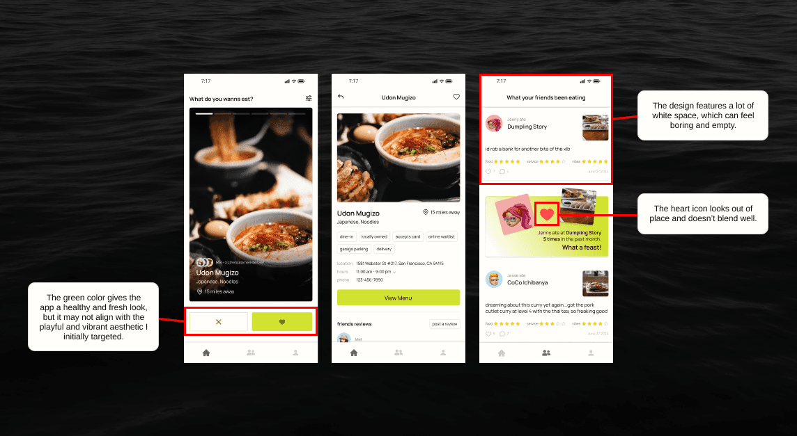
Participants found the concept intriguing and enjoyed the reviews but noted that the design lacked excitement.
Review #1
Bland Presentation
Participants found the concept intriguing and enjoyed the reviews but noted that the design lacked excitement.
Review #1
Bland Presentation
Participants found the concept intriguing and enjoyed the reviews but noted that the design lacked excitement.


What I cooked
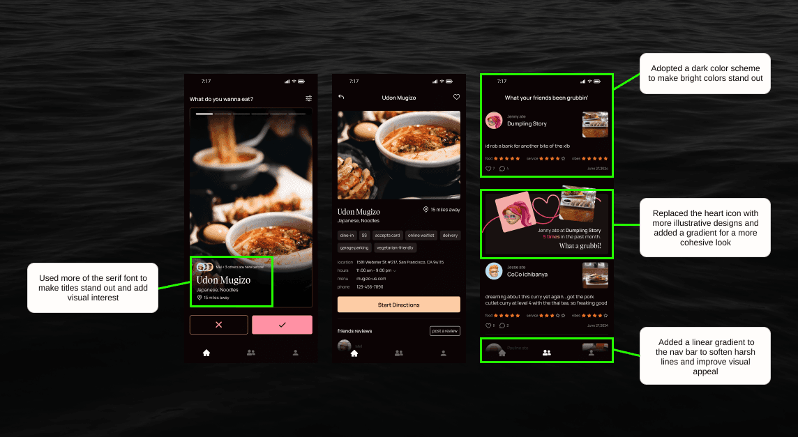
I implemented a dark mode to use a brighter, more vibrant color palette that stands out and adds visual interest.
What I cooked
I implemented a dark mode to use a brighter, more vibrant color palette that stands out and adds visual interest.
What I cooked
I implemented a dark mode to use a brighter, more vibrant color palette that stands out and adds visual interest.


Review #2
A Taste of Location
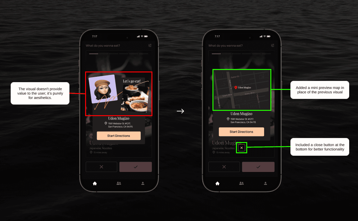
Participants wanted to see the streets and areas where restaurants are located before getting directions.
Review #2
A Taste of Location
Participants wanted to see the streets and areas where restaurants are located before getting directions.
Review #2
A Taste of Location
Participants wanted to see the streets and areas where restaurants are located before getting directions.
What I cooked
Added a mini preview map for visualizing restaurant locations.
What I cooked
Added a mini preview map for visualizing restaurant locations.
What I cooked
Added a mini preview map for visualizing restaurant locations.


Culinary Colors
As a personal challenge, I used colors with culinary-inspired names. This added extra preparation time but encouraged me to find fun color combinations and integrate them creatively into the design without it looking unappetizing.
Culinary Colors
As a personal challenge, I used colors with culinary-inspired names. This added extra preparation time but encouraged me to find fun color combinations and integrate them creatively into the design without it looking unappetizing.
Culinary Colors
As a personal challenge, I used colors with culinary-inspired names. This added extra preparation time but encouraged me to find fun color combinations and integrate them creatively into the design without it looking unappetizing.


reflection
Take Out
This personal project allowed me to practice my skills in designing for mobile, a shift from my usual focus on desktop and responsive sites. Grubbi was especially enjoyable as it addresses a problem I often face myself—deciding where to eat. I enjoyed exploring the mood and tone for the app, ultimately choosing a playful and humorous approach to food reviews, which added a fun element to the design process. Overall, this project not only helped me improve my mobile design skills but also provided a creative solution for a common problem, making the experience both educational and enjoyable.